Searching for Wikipedia: How do our readers find us?

It's no secret that search engines ferry a great deal of traffic to Wikipedia. With every major change in how a search engine presents its results,[a] questions arise about how the change might affect Wikipedia traffic. Historically, there has been scant data about how search engine traffic varied by platform and region.
We are taking a small step towards shedding greater light on the relationship between Search and Wikipedia by releasing a new, daily dataset of Wikipedia pageviews referred directly from search engines split by Wikipedia language, search engine, operating system, and web browser.
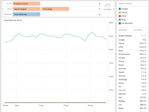
What might you find combing through the data? Well, first, you'll discover there's a lot of data! In any given month, about eight billion pageviews to Wikipedia come directly from clicks on search engines. On any given day, this dataset showcases pageviews that come from about 220 different countries, 100 different languages of Wikipedia,[b] 50 browser families, 14 operating systems, and 20 search engines.[c]
The vast majority of those clicks—over 90%—come from Google Search (table; see Figure 1). The next closest competitor is Yahoo Search at 2% of views followed by Microsoft Bing, DuckDuckGo, and Yandex Search. While Google's search traffic is globally quite dominant, many of the smaller search engines see their share of search coming primarily from a single country—e.g., 70% of Yahoo!'s search comes from Japan; 90% of Yandex's search comes from Russia; almost 100% of Naver's search comes from South Korea (nested table).
The increasing dominance of mobile devices can be seen in this dataset as well but with slightly more variation between countries than between search engines. Android and iOS typically trade between the top two spots with Windows generally in a strong third place (heatmap). Browsers have similar dynamics but replace Android with Chrome Mobile, iOS with Safari, and add a few more desktop versions into the mix (heatmap).

The multi-faceted nature of this new dataset also presented some new display challenges. Most datasets we release consist of a target metric—e.g., pageviews—and are composed of a single facet—e.g., language edition—or sometimes hierarchical facets—e.g., you can split by project family like Wikipedia or individual languages of Wikipedia. This dataset has five, non-hierarchical facets, all with many categories, as highlighted in the previous section.
Maybe you're interested in which search engine is dominant in a particular market? Or how Android users compare to iOS users? Or the distribution of language editions in a given country? Or, or, or…? This makes our standard public dashboards — Wikistats, Dashiki, Discovery — a poor fit for someone who might want to slice or aggregate the data as they primarily support a single dominant facet.
Luckily, Wikimedia has some experience with an open-source dashboarding platform called Turnilo that is a perfect fit. Turnilo allows for us to create quick, dynamic filters and aggregations, supports a variety of displays—e.g., tables, line graphs, or heatmaps—and makes it easy to share specific views of the data via URLs. We currently use Turnilo to showcase a number of private datasets, so we had some experience working with it but had never provided a publicly-viewable version. In just a few hours, we built a public Turnilo instance on our Cloud VPS infrastructure (code). We worked with the Turnilo team to improve support for flat files (as opposed to their more popular, but more complex Druid back-end). And now we have a strong use-case for expanding our public dataset dashboarding options (Phab)!
Go check it out at: https://wiki-search-referrals.wmcloud.org/ And if all the options are a bit overwhelming, here's a good place to start: search referrals from the previous month split by country and search engine (link).


Discuss this story